Say what you mean, do what you love and fucking send it
Science gets playful in people-centred design for next-level fitness coaching
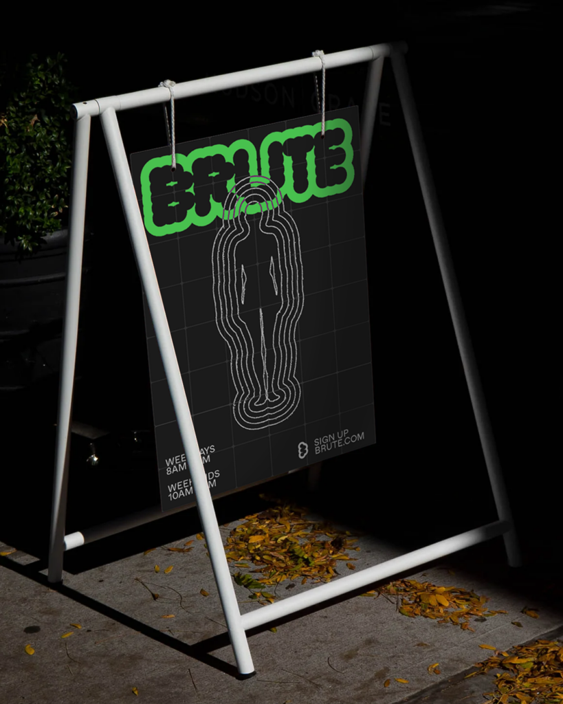
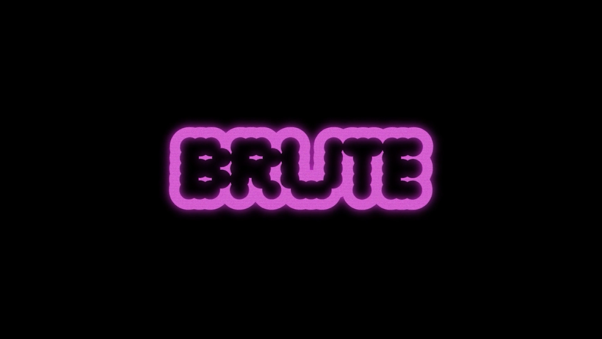
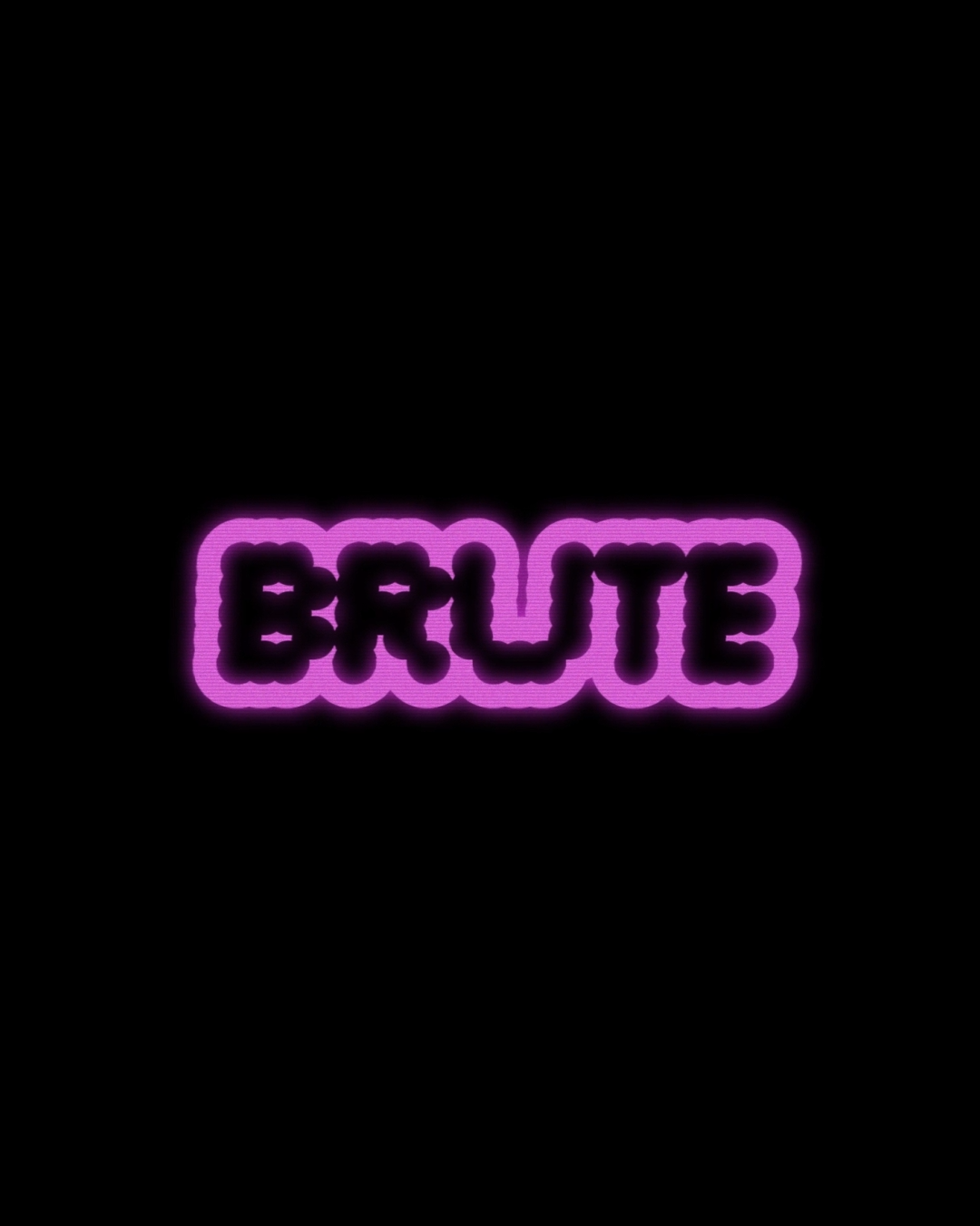
Brute, formerly known as Brute Strength Training, is a coaching organization specializing in personalized training programs for athletes at all levels. It is known for blending creativity with scientific methodologies to help clients and pro athletes – including Dallin Pepper, James Sprague and Fee Saghafi – achieve greatness. We worked with the organisation to devise an expressive, contemporary and playful visual identity in contrast to a new, shortened name: Brute.
Industry Fitness + leisure
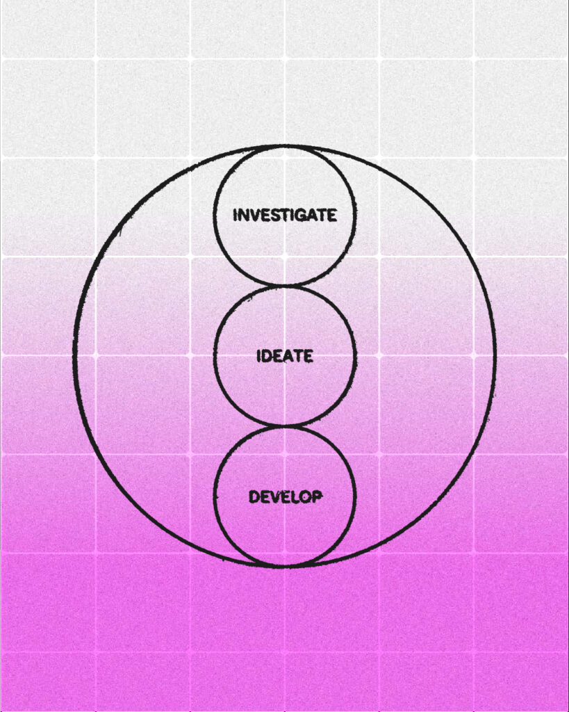
The logotype features individual circles representing iterative stages of progression, merged to symbolise growth and connection, which is dynamically expressed through animation. Emphasising ‘U’ as central to all progression.
The logo mark is representative of the letter ‘B’ for Brute. It represents the idea of science and creativity working together as the individual fuse like a molecule. Graphic shapes represent movement, growth and positivity. The colour palette is designed to express energy, excitement and optimism.
It represents the idea of science and creativity working together as the individual dots come together like a molecule.