Say what you mean, do what you love and fucking send it
Industrial training aesthetics for a heavy-hitting product launch
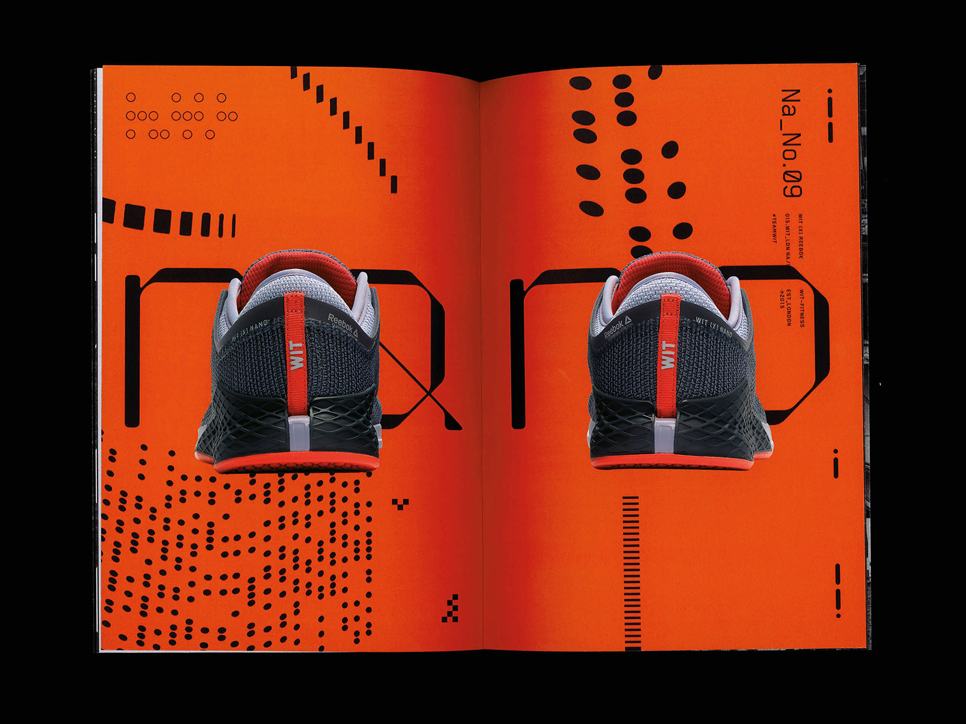
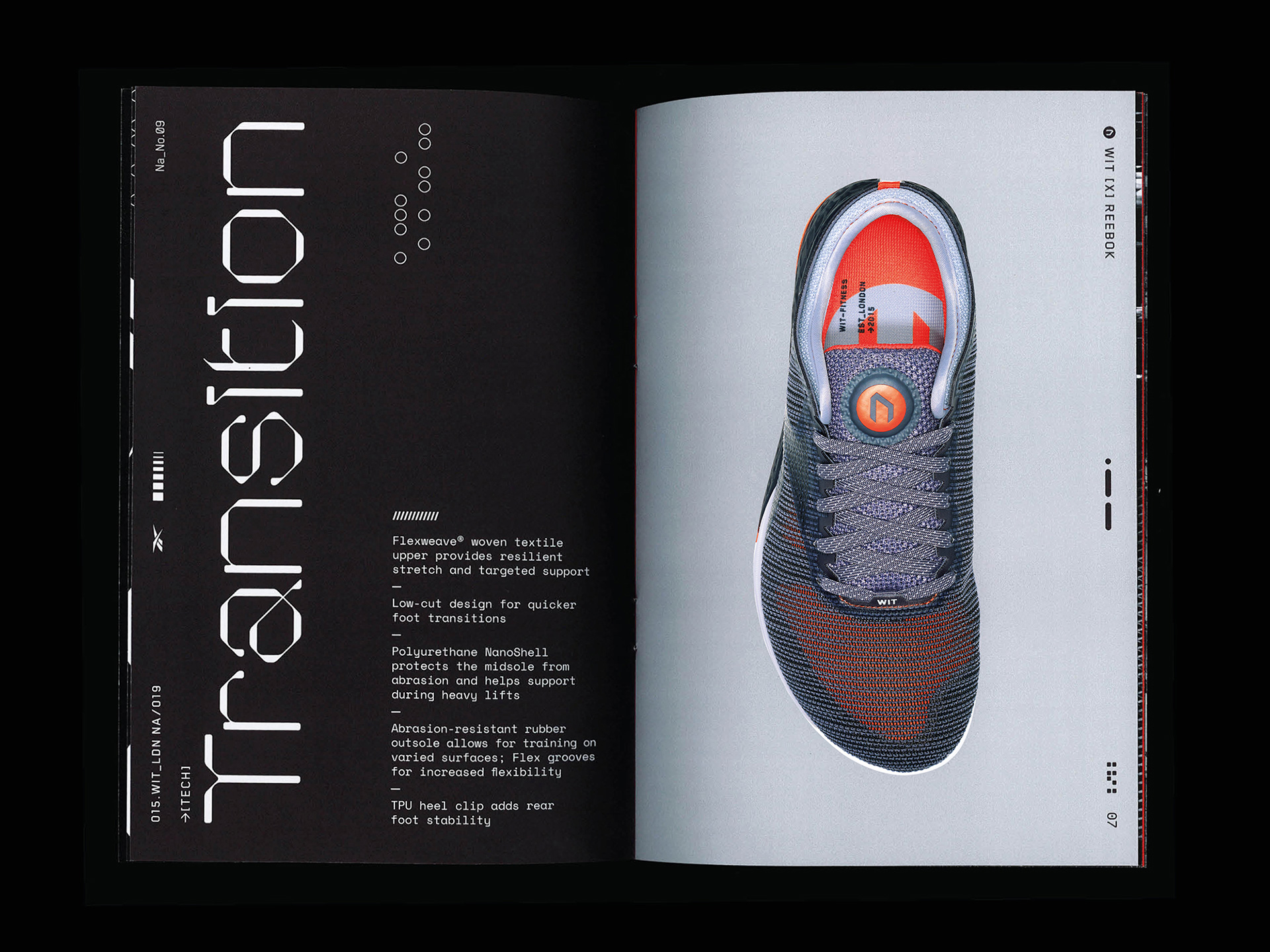
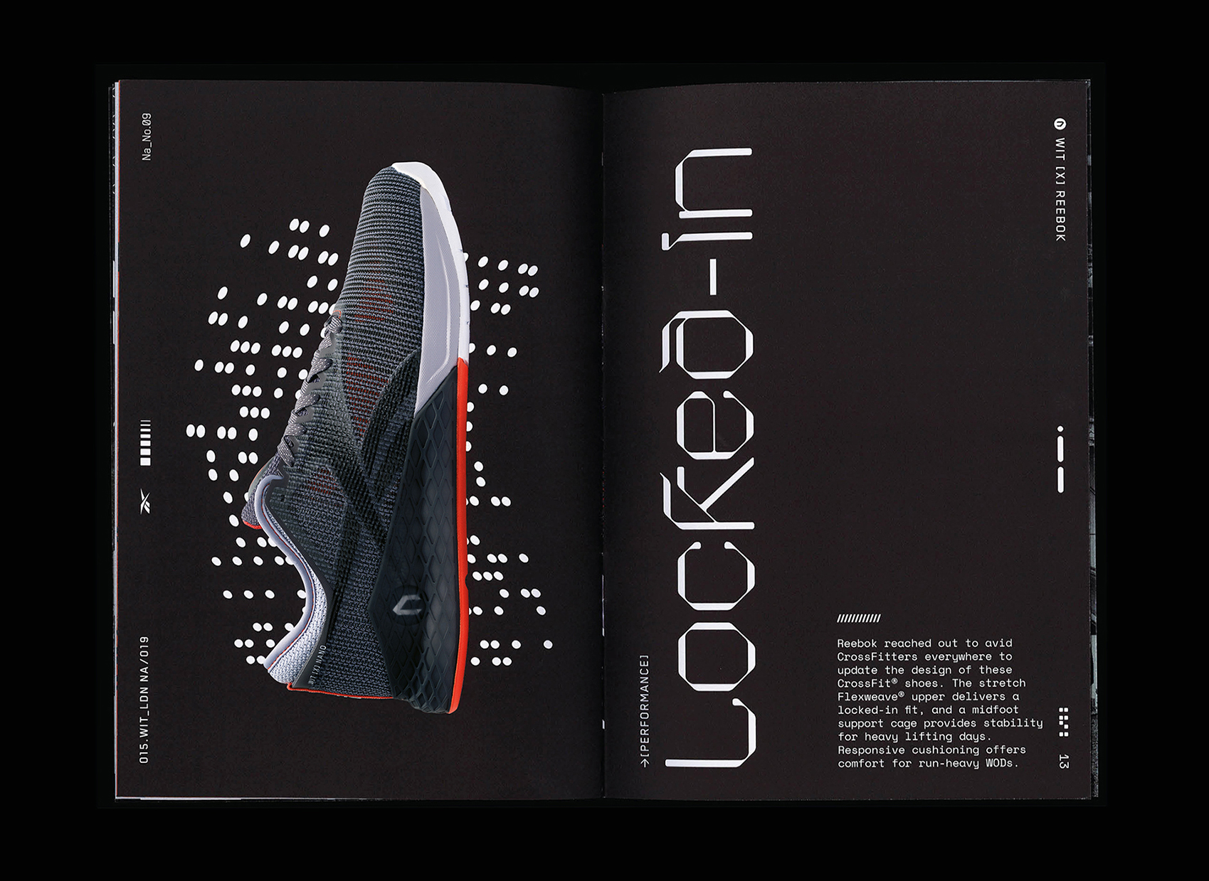
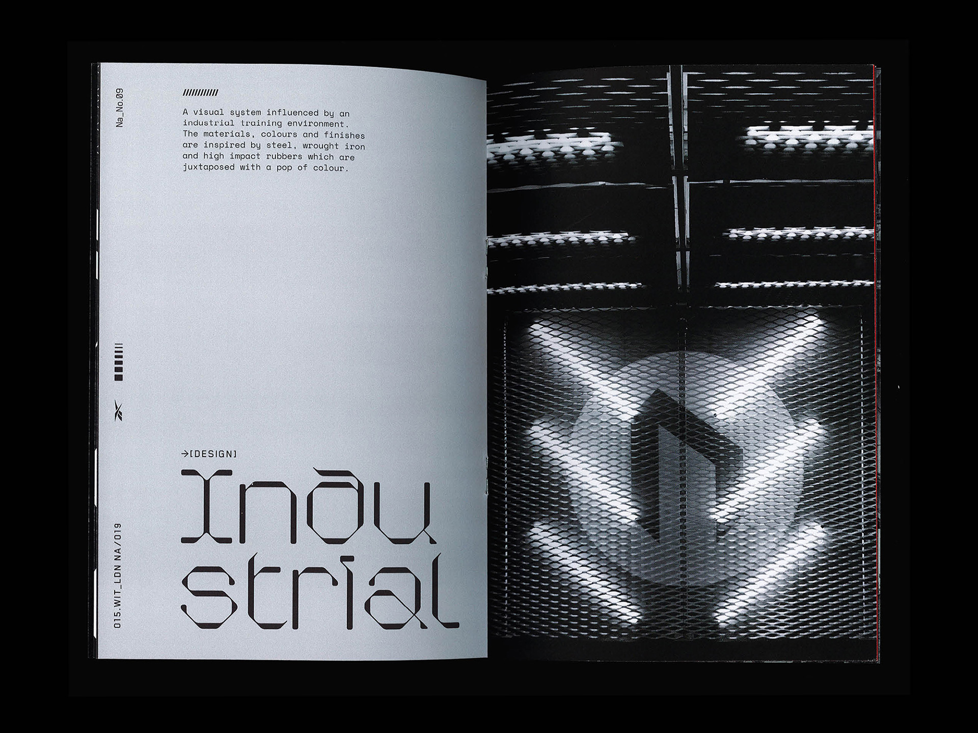
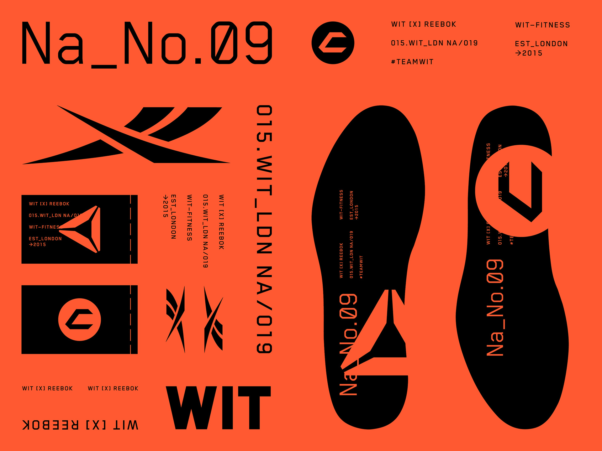
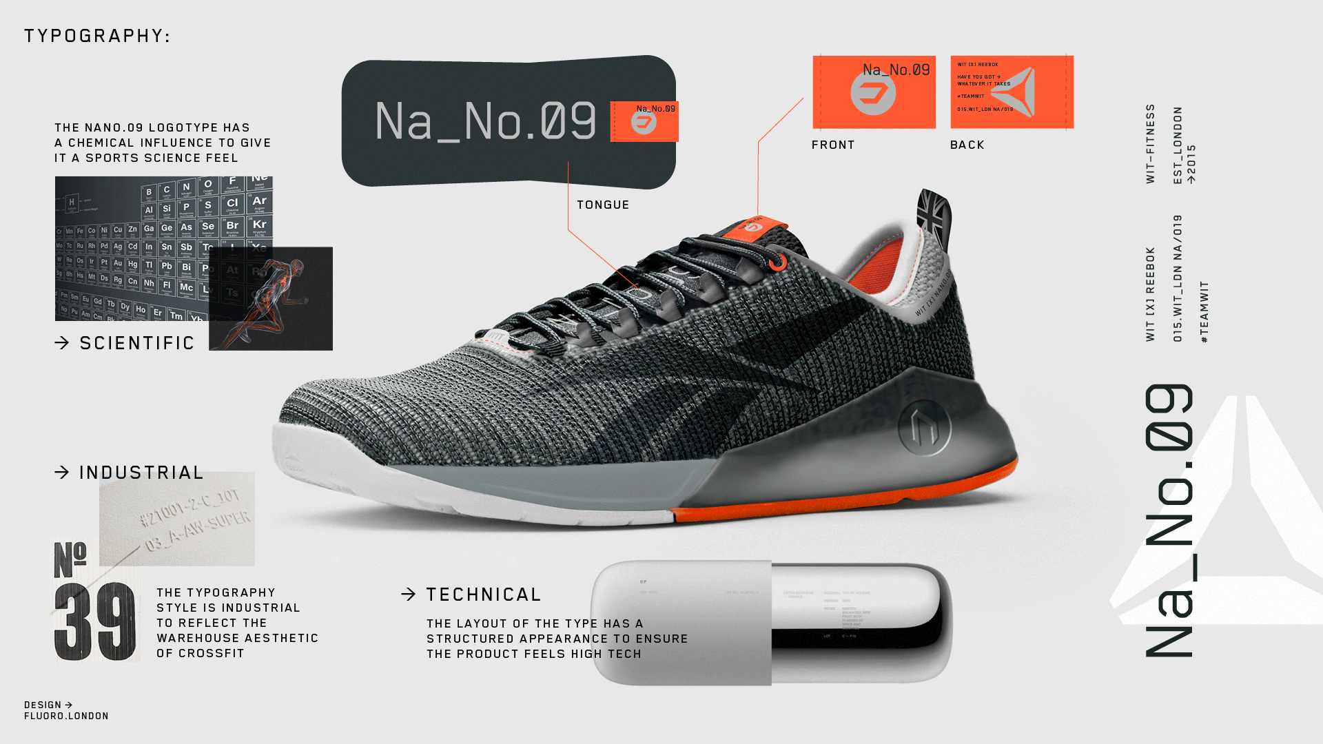
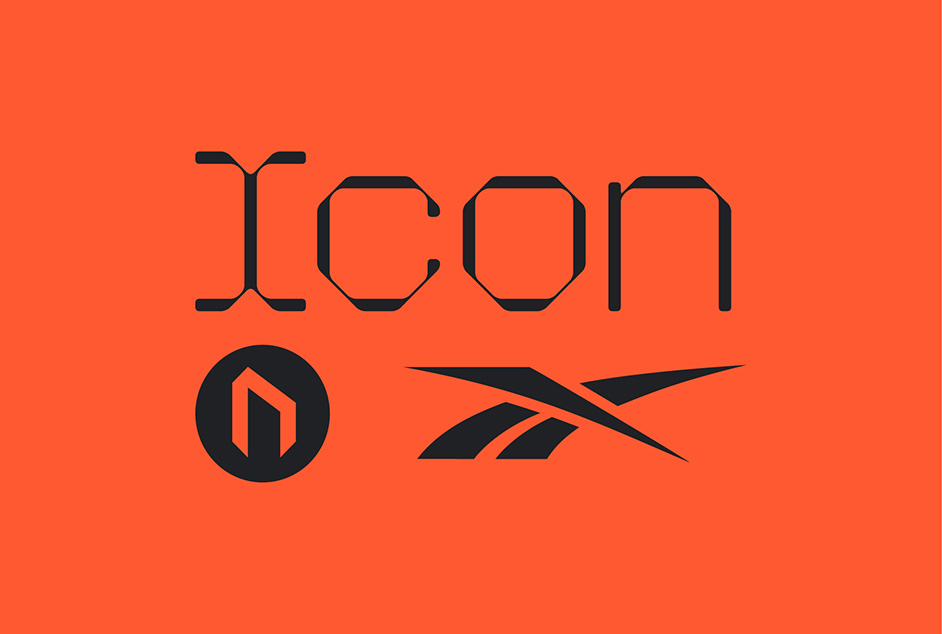
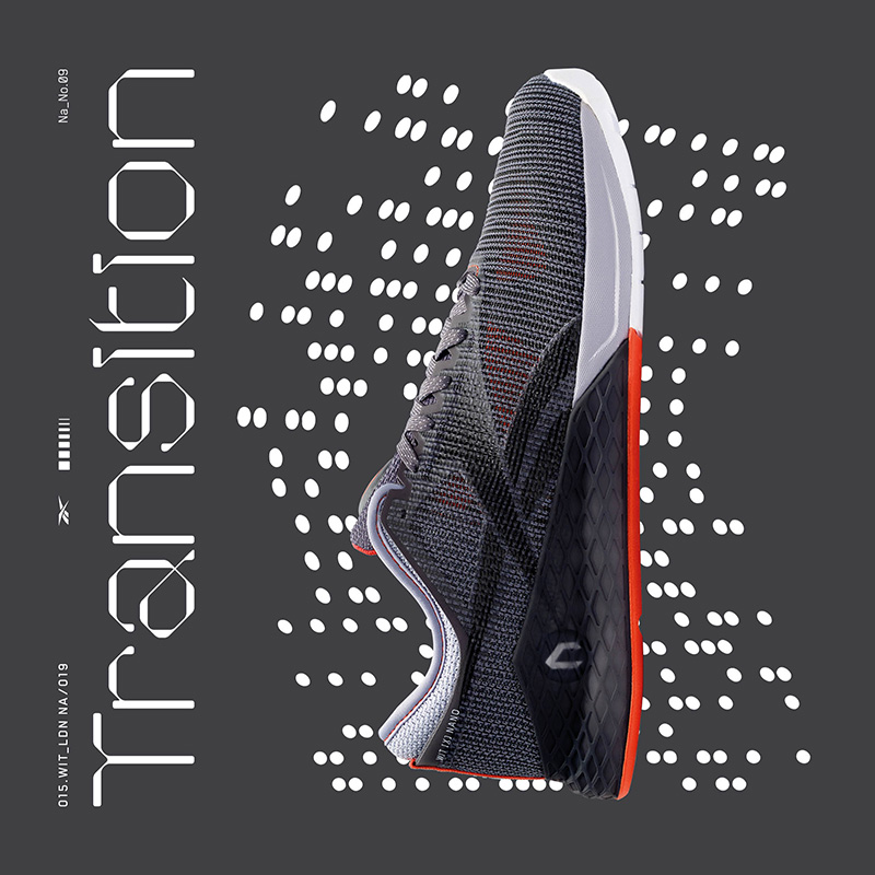
Reebok and pioneering fitness brand WIT (Whatever It Takes) asked us to create a graphic system for the launch of the limited-edition Reebok Nano 9 shoe, giving us creative freedom to experiment. This was the first line of trainers to incorporate the re-introduced Reebok vector logo. We took the Nano 9 as a blank canvas still in its initial sketch stage from Reebok and infused the WIT ‘stronger together’ ethos. The material colours and finishes are inspired by steel, wrought iron, chain mail and high-impact rubbers, juxtaposed against a vibrant orange.
Industry Fitness + leisure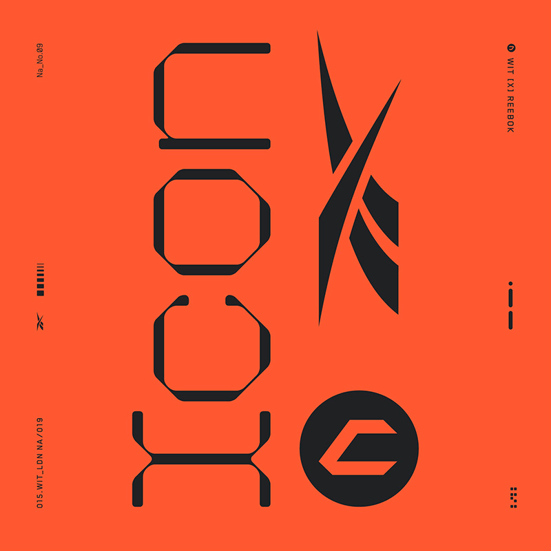
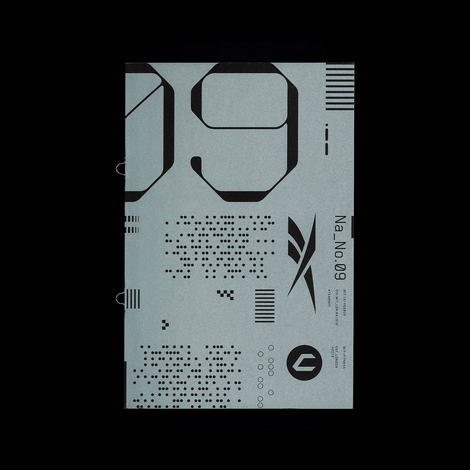
We created a bespoke, abstract typographic system inspired by WITs industrial training environment. This was used across the product, editorial designs – including a campaign booklet with beautiful metallic inks – and throughout all WIT platforms,
The material colours and finishes are inspired by steel, wrought iron, chain mail and high-impact rubbers
Backed by strong design to celebrate the shoe, the Nano 9 proved to be one of the biggest pre-launches in WIT’s history, with more than 1000 units of footwear sold in minutes.